Critical Evaluation

Branding and Identity – 

Overall, I am pleased with the look of the brand and I think this works well as a brand Identity. The main target audience of the barbers I wanted to attract was the young professional man and to do this, I researched into the design styles which surrounds them. Therefore, I think that the style and simplistic approach to the logo works. However, I think that the brand could have had more to do with hair styling and beard products, as I think that the small image of the scissors did not suggest this enough. The font is appropriate and I think this works well with the line appearance and the French look. I also think that the logo does work well with the website and the elements of the product design look sleek and exclusive which is what I was aiming to create. 

I enjoyed this branding task, however, I found it difficult to design a logo which explores the business without being too overpowering and so I went for a simplistic and professional look to the brand. 


Children’s Book – 

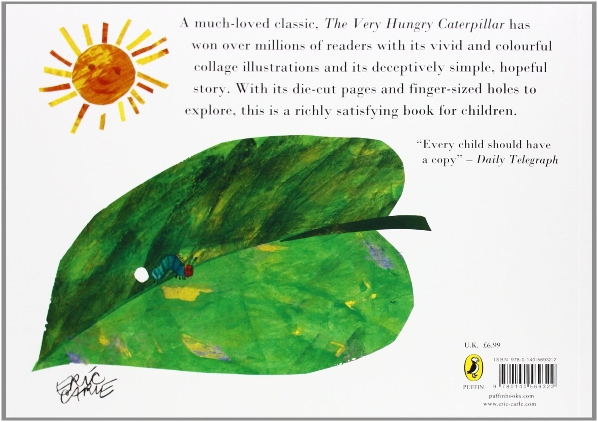
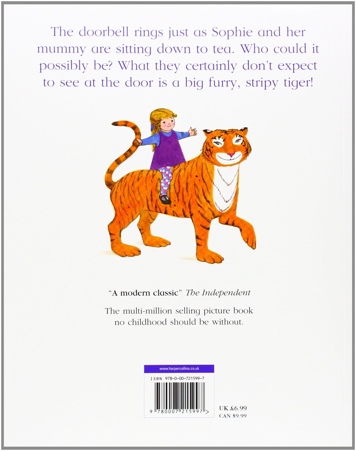
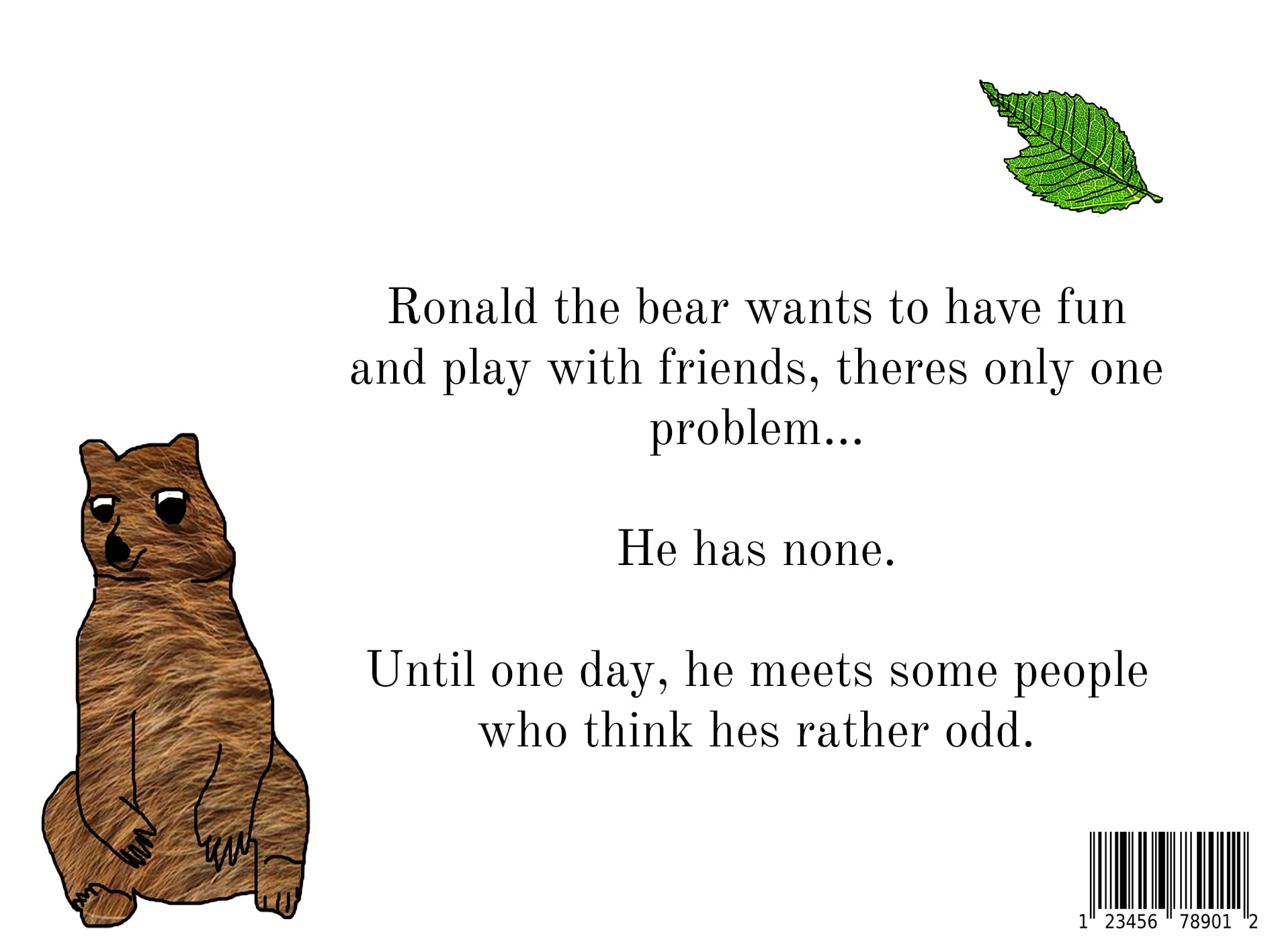
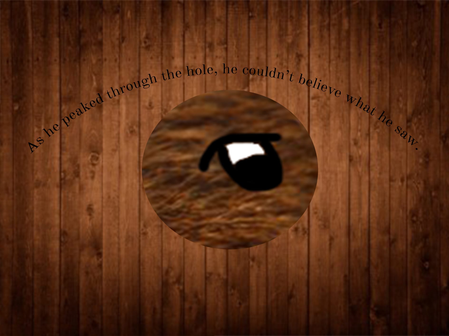
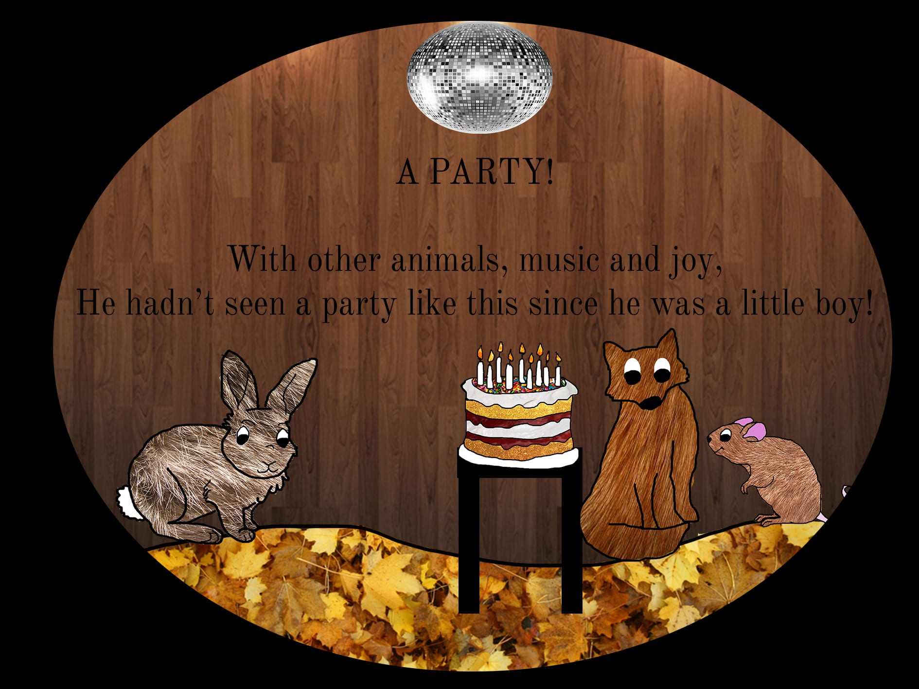
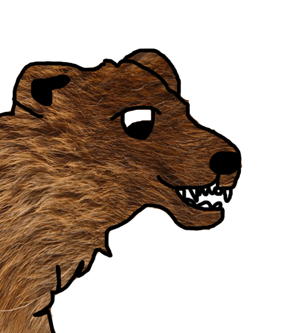
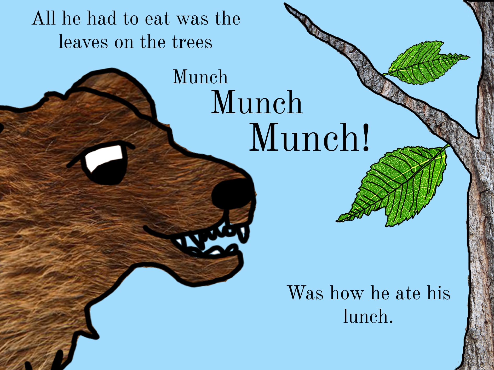
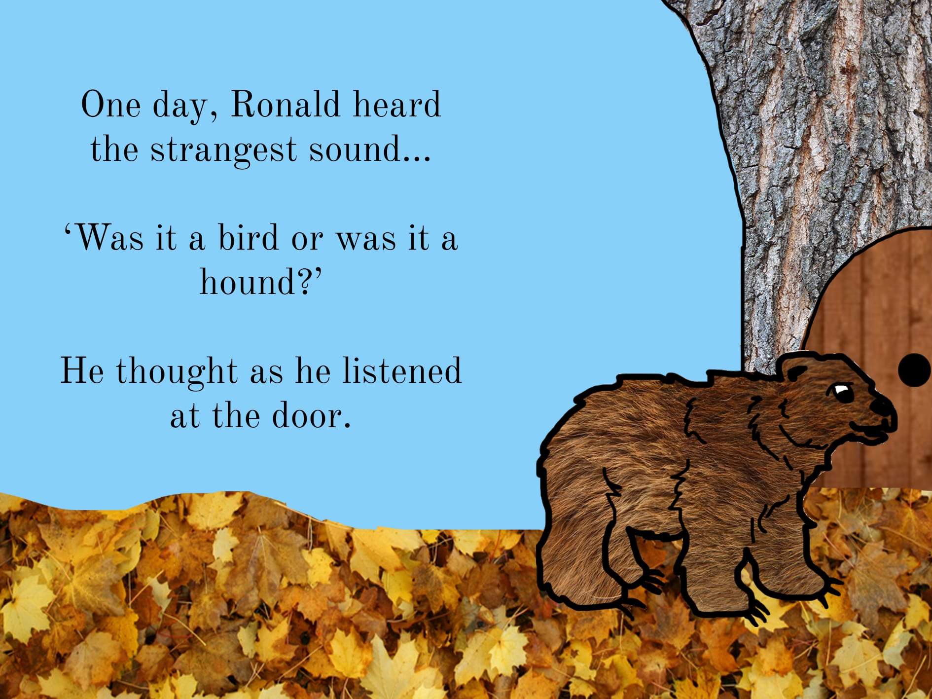
For me, the children’s book task was very interesting in exploring drawing and also digital book making. I think that the characters I created in the book work well and the character of Ronald the Bear is approachable but also put across the idea of being different, which is what I wanted to show as well as the idea of being on the outside. The book is aimed at children ages 5-7 which is an age where making friends is important and therefore I wanted to explore this. However, as usual, my time management of the project was not the best and spent far too much time on creating the characters and the different features of the book and therefore when the work of the last 3 pages disappeared,  I didn’t finish the story to the full, which is a shame as I had ideas which could have worked in the narrative. However, the pages which are there are colourful and I think they are interesting to look at and work as a book aimed at 5-7 year olds. 

I enjoyed this task and I learnt a lot in how to create images and use textures from photographs which are edited on photoshop. If I where to create the book, I would like to look at using real textures for the book and see how this would work. 

Finshed Book

With the little time to create the book and technical problems I had with the last 3 pages, I have created the first 7 pages of the book and then the front cover and back cover. 

I think that the images on this are good in creating a character and the style of design is typical of a children’s book, however I have added more colour to the backgrounds both to set context and to brighten up the scene. 

I think the digital images work together with the textures and I think the hand drawn style suits the setting and the context. 

Here is the PDF of the first 7 pages with the front and back covers. 

Bears like cake too

As I will say in the evaluation, I would have liked to finish the book, but as usual, I spent too long creating the characters and therefore was not able to create the pages again once there where technical problems. But I am happy with the design and look of the book. 

Back Cover

With the back cover, I looked at how Judith Kurr and Eric Carl uesd their front covers to influence the back covers of their books. 

81cEu4Dwj6L 71WgXvd+upL

Each of these are simple like their front covers and also they use elements of the narrative with the images. I wanted to use this idea as well to show information about the book and also use the images for the cover. 

Back Cover


I think this back cover works well with the front cover and is simple, with the main features of the book on along with the information about the story. 

Pages 4 and 5

The next page I would have as a cut out of the page so the child is able to look through the door as Ronald would. I decided to use the wooden texture to suggest that this is the door to the Animal’s house and that Ronald is bigger than this. 

Page 4

The mystery is the element of this page which is created with the dark lighting I added through photoshop in order to make it appear as though Ronald is looking in on something secret. 

The design of the words on this page also suggest that something exciting is happening, a feature which is used in a number of children’s books, including The Very Hungry Caterpillar. 

The page then opens to the next, which then reveals the party with the Forest animals which are in the party. 

Page 5


The page would reveal the animals partying around the cake which is shown on the front cover. The Children are introduced to the animals like this because I wanted them to experience it the same as Ronald. 

As I didnt have a glitter ball, I got this from the internet at http://www.solarsystemscope.com/nexus/textures/texture_pack/assets/preview_sun.jpg

I like how both pages link together and the reader experiences the narrative as Ronald would in the story, this is an element which is familiar with childrens books and with Bears Like Cake too, it also is a feature which works. 

Pages 3 and 4

For the Second page, I needed the bear to be eating and therefore, I wanted to create an image of him looking unaware that he is missing out on the food which is at the party. Therefore, I made him look neutral, however with a big expression on his face to be humorous for the children. 

Bear Eating


I drew the outline of the bear close up and added teeth to suggest he is eating, then adding the texture to the outline. 

Page 2


The wording on this page is stepped to create movement, something which is used in a number of children’s books as it is more interesting to read allowed to Children. I kept with the same background to suggest he is in the same location and the leaves are also created with real images of the leaves zoomed in. 

Page 3

This page was to suggest to the reader that Ronald is looking into the house for the party. I like the design of this as it explains that Ronald is too big to fit through the door as well as physically showing his difference and exclusion with the tree house and him being outside. 

I decided to not include the sun and the clouds in the background of this page as I wanted to suggest that he has moved along the Forest and the weather is clearing as he hears the noise of the other animals. 

I am pleased with how these pages look, and I like the design of the different features of the book.