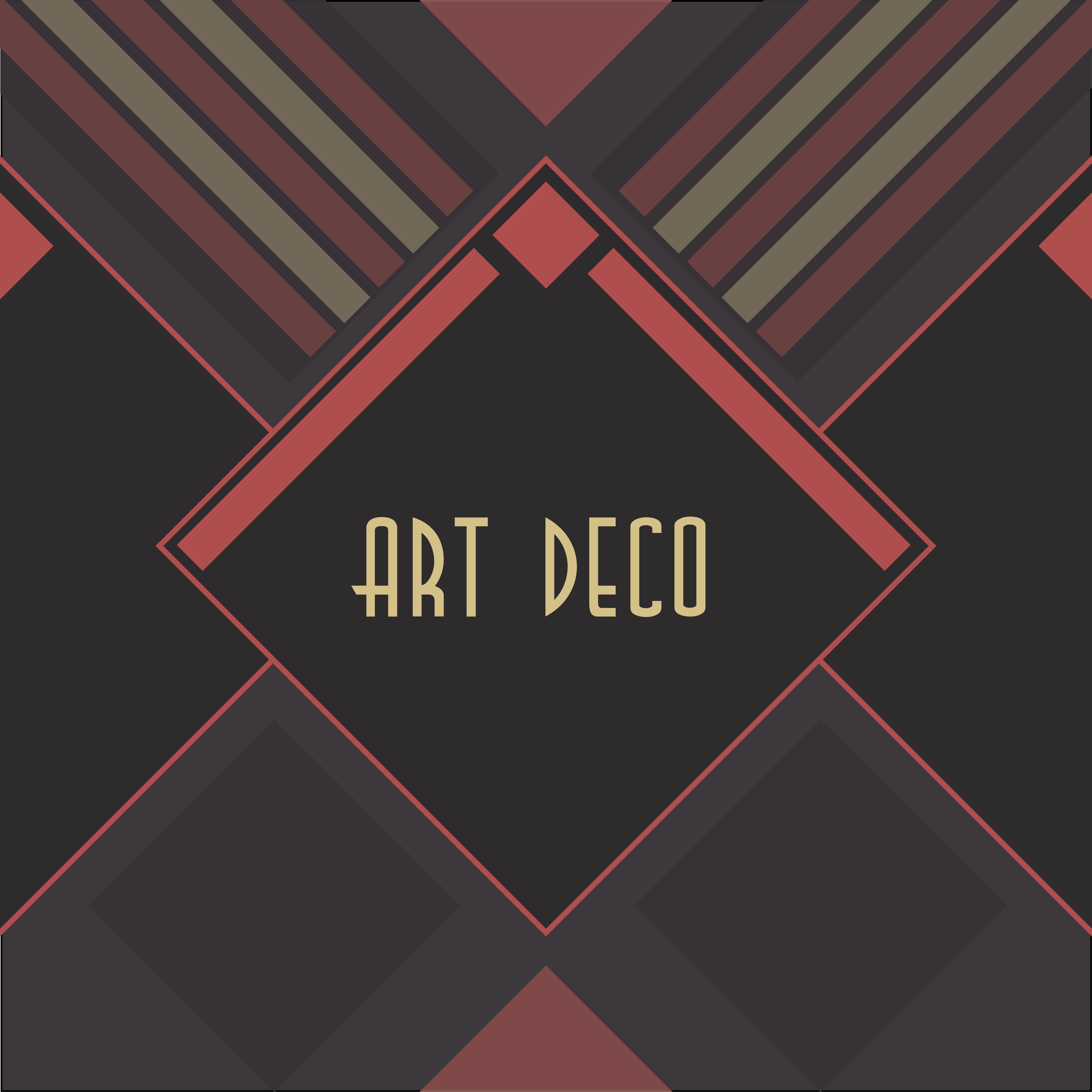
Art Deco Design

The Art Deco Style

art-deco-cover-26

I looked further into the art deco design of the 1920’s and wanted to get a better understanding of the origins of this movement and how I could incorporate this into my design. It has many features which are similar to that of the nineteenth century Art Nouveau art movement which:

Relied on floral motifs to pattern and ornament its building and other artefacts, whereas, Art Deco was thoroughly modern in turning away from the winding, sinuous qualities of Art Nouveau, looking instead to those of abstract design and colour for colour’s sake.”  (Art Deco, Grange Books.) 

This style that was very structured and organised was something that interested me and I wanted to see how I could experiment with this in my own way and see how this could be used to create an interesting and different style. I began with a simple drawing of a few letters as a simple Art Deco design. 

IMG_5029

I decided to experiment with the use of lines and the structured detail of the letters which I think worked well with the original design and gave the letters a sense of modern typography design. However, this design is very simple and could have a lot more done to it in order to create a more visually interesting type face. 

Experimenting with Art Nouveau

In order to get a better understanding of the inspirations of Art Deco, I decided to create my own Art Nouveau inspired letter and to see how this could influence my typographical style. I liked the Art Nouveau poster design and particularly liked the design of this typeface and the floral aspect to it. 

 Poster

IMG_5033

IMG_5035 The first image is my sketch of an example of an Art Nouveau style typeface and was particularly inspired by particularly the poster design. I really like the bold pattern of the letters and how this reflects the style of Art Nouveau in Paris. 

The second image shows the improvements I made to the original design in colour and detail. When looking at the Art Nouveau style, the colour and the pattern was something which was very bold and I wanted to reflect that in my design. I used Gold and Silver paint markers which have relevance to the Art Deco style, particularly in New York 1920’s/30’s and I liked how this made the letter stand out and reflect the luxurious style of the Art Deco Design. 


“There was going to be no more poverty, no more ignorance, no more disease. Art Deco reflected that confidence, vigour and optimism by using symbols, of progress, speed and power.” – Robert McGregor. 

Key Designs in Typography History

When I have been thinking about where I find the most interesting type faces, I have been particularly looking into typefaces that have been iconic in history. I think that many commercial type has connections to the iconic styles of the 1930’s, 40’s and 50’s. There are a few typefaces that stand out from these eras and I have found particular interest in these. 

1930’s Art Deco Design:

I have always been very interested in the art deco design movement throughout the 1920’s and 30’s, particularly in American Culture. So when I started to look at type faces throughout history, this was something which I really wanted to know more about. 

Art Deco Design has connections with the 1925 Paris Exhibition ‘Exposition Internationale des Arts Decoratifs’ This exhibition showcased the new design movement of Art Deco, which portrayed ‘French Taste’ and ‘Luxury Goods’. French Design was very prominent in the world of Design throughout the 1920’s and 30’s. 

This is the poster for this exhibition and clearly portrays the Art deco design which was coming into from Paris. 

2006al4802_bonfils_paris_1925_poster

I really like the way in which the letters clearly represent a design movement which stands for the representation of Paris at the time after World War 1, showing luxurious imagery and experimental typography. 

This is something I would like to look further into and experiment with my own art deco type face, seeing the different ways in which Art Deco works in commercial type. 

1940’s Poster Typography:

I looked into the typefaces which where used throughout the 1940’s and found that military based type and also a very handwritten style where very common of this era. The type faces which where familiar of the 1940’s seemed to be very structured and very bold. I particularly looked at the famous posters which where around in the time. With Typography being a bold part of poster design throughout Wartime in Britain and America, I found a number of bold examples of type. 

back-the-great-attack-with-war-savingsFWW001let-us-go-forwardgrow-your-own-vegetableslargewomen-wantedAir-raid-wardens-wanted

The type that is used on these posters is very bold and stands out to serve a specific purpose throughout wartime. I like this bold and structured typeface and would like to experiment with different styles that could be used in different contexts. 

The 1940’s have a number of interesting typefaces which I would like to explore further to find inspirations for my typography design. 


Initial Inspirations and Typography in Brands

Recently, I have had the typical design student habit of overanalysing every typeface I see, whether it be on a sign, a menu or even on a crisp packet. I also have started to look at the different types of typography that are available through creative social media and online artists. 

I have set up my own Pinterest page which features different ideas and mood boards which will help to inspire my own original typeface. 

———-https://www.pinterest.com/BethL2design/ ————–

When looking at the type that is found in mainstream and alternative media, I particularly noticed the difference between the functional and the experimental typography.

For example, some mainstream brands use very structured typefaces similar to that of Helvetica or a standard serif font. These are clear and stand out amongst other branded shops/magazines or products. Supermarkets are an example of this. 

tesco               morrisons-logo       asda-logowaitrose-logo

These supermarkets use very a bold and structured typeface, mainly using the brand colour which is clear to the customer. The designer of the Tesco font is Dalton Maag, International type designers who design for local and Global businesses such as Lush and Samsung. These typefaces are built for a purpose of being able to recognise the brand name as a function, they are bold and structured for this purpose. I like the idea that there are bold fonts which stand out for a specific reason to help the customer become familiar with the distinctive brand. 

In Lincoln, there are a number of independent businesses with interesting typefaces which attract an audience in similar ways but with different styles which reflect the independent, small business and the products they sell. 

12026432_10206636272618600_1102710232_n12021866_10206636273738628_238813956_n-2Screen Shot 2015-10-16 at 15.52.06 Screen Shot 2015-10-16 at 15.55.1112048876_10206636272458596_1108631446_n12023256_10206636273698627_872104329_n

These have a very different style to that of the supermarket brands in that the type in the smaller independent shops has a very homemade or experimental style to it. The antique store uses traditional handwritten type that would have been with handmade painted type which suits the style of shop. Handwritten fonts are a common theme in the typography of Steep Hill and reflects the type of shops which use them. 

I would like to explore the use of handwritten and independent shops to see how they are used as a way to create a specific type of brand opposed to the commercial supermarkets and businesses. 

An Introduction to Typography!

Hello! 

When first thinking about Typography and where to find it, in the workshop, we went into the city and had a look at the typography which is everywhere around us! Something which every day we don’t really think about, although I found there to be inspiration for Typography on signs, posters and even food packages around the City! Here are a few that I particularly found interesting around Lincoln:

12053298_10206636273978634_999794802_n

This was an advert outside a book store. This caught my attention because of the hand drawn style and the clear colours used to help it stand out next to the other adverts. The bold text which very structured is something which is interesting to think about in adverts and how this is used to attract the audience’s attention.

12023256_10206636273698627_872104329_n

This handwritten text is also used in a similar way to advertise the scarves and something that was common within the small businesses around Lincoln. It shows a very homely and even a nostalgia style which is something that I would like to learn more about.

12033372_10206636271418570_2095722368_n12053126_10206636271618575_1165014067_n

One typface style that I found around Lincoln was the Art Deco style. Having been always interested in 1930’s design, this was of particular interest to me. The poster is an advert for the university’s Grad Ball which is “Great Gatsby” theme and the “Ritz” sign is for a Weatherspoon’s which is also echoing the Art Deco theme.