When I have been thinking about where I find the most interesting type faces, I have been particularly looking into typefaces that have been iconic in history. I think that many commercial type has connections to the iconic styles of the 1930’s, 40’s and 50’s. There are a few typefaces that stand out from these eras and I have found particular interest in these.
1930’s Art Deco Design:
I have always been very interested in the art deco design movement throughout the 1920’s and 30’s, particularly in American Culture. So when I started to look at type faces throughout history, this was something which I really wanted to know more about.
Art Deco Design has connections with the 1925 Paris Exhibition ‘Exposition Internationale des Arts Decoratifs’ This exhibition showcased the new design movement of Art Deco, which portrayed ‘French Taste’ and ‘Luxury Goods’. French Design was very prominent in the world of Design throughout the 1920’s and 30’s.
This is the poster for this exhibition and clearly portrays the Art deco design which was coming into from Paris.

I really like the way in which the letters clearly represent a design movement which stands for the representation of Paris at the time after World War 1, showing luxurious imagery and experimental typography.
This is something I would like to look further into and experiment with my own art deco type face, seeing the different ways in which Art Deco works in commercial type.
1940’s Poster Typography:
I looked into the typefaces which where used throughout the 1940’s and found that military based type and also a very handwritten style where very common of this era. The type faces which where familiar of the 1940’s seemed to be very structured and very bold. I particularly looked at the famous posters which where around in the time. With Typography being a bold part of poster design throughout Wartime in Britain and America, I found a number of bold examples of type.

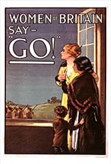
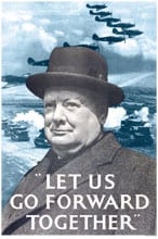

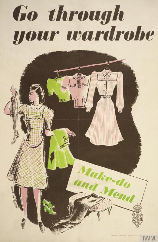


The type that is used on these posters is very bold and stands out to serve a specific purpose throughout wartime. I like this bold and structured typeface and would like to experiment with different styles that could be used in different contexts.
The 1940’s have a number of interesting typefaces which I would like to explore further to find inspirations for my typography design.
Leave a comment