Initial Inspirations and Typography in Brands

Recently, I have had the typical design student habit of overanalysing every typeface I see, whether it be on a sign, a menu or even on a crisp packet. I also have started to look at the different types of typography that are available through creative social media and online artists. 

I have set up my own Pinterest page which features different ideas and mood boards which will help to inspire my own original typeface. 

———-https://www.pinterest.com/BethL2design/ ————–

When looking at the type that is found in mainstream and alternative media, I particularly noticed the difference between the functional and the experimental typography.

For example, some mainstream brands use very structured typefaces similar to that of Helvetica or a standard serif font. These are clear and stand out amongst other branded shops/magazines or products. Supermarkets are an example of this. 

tesco               morrisons-logo       asda-logowaitrose-logo

These supermarkets use very a bold and structured typeface, mainly using the brand colour which is clear to the customer. The designer of the Tesco font is Dalton Maag, International type designers who design for local and Global businesses such as Lush and Samsung. These typefaces are built for a purpose of being able to recognise the brand name as a function, they are bold and structured for this purpose. I like the idea that there are bold fonts which stand out for a specific reason to help the customer become familiar with the distinctive brand. 

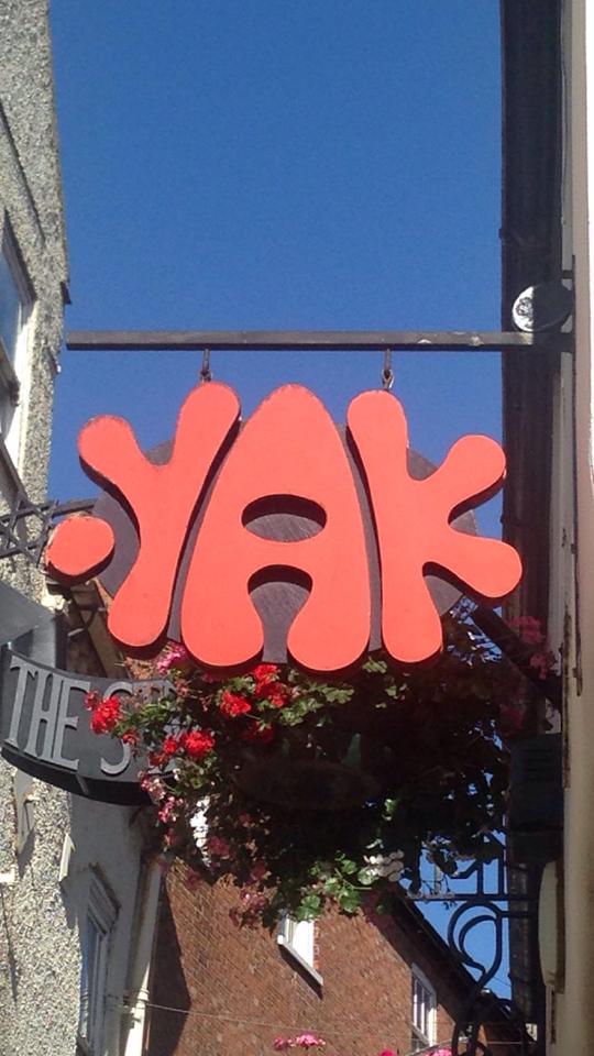
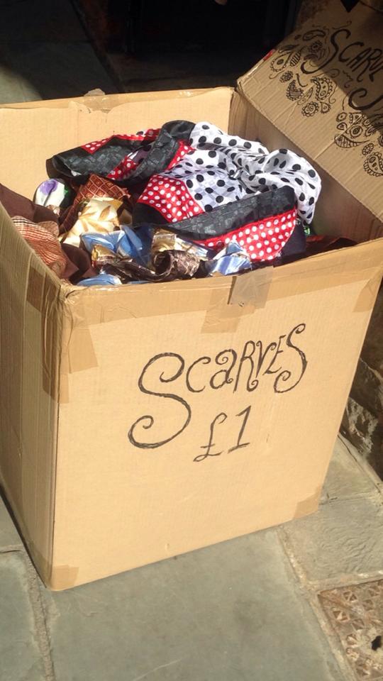
In Lincoln, there are a number of independent businesses with interesting typefaces which attract an audience in similar ways but with different styles which reflect the independent, small business and the products they sell. 

12026432_10206636272618600_1102710232_n12021866_10206636273738628_238813956_n-2Screen Shot 2015-10-16 at 15.52.06 Screen Shot 2015-10-16 at 15.55.1112048876_10206636272458596_1108631446_n12023256_10206636273698627_872104329_n

These have a very different style to that of the supermarket brands in that the type in the smaller independent shops has a very homemade or experimental style to it. The antique store uses traditional handwritten type that would have been with handmade painted type which suits the style of shop. Handwritten fonts are a common theme in the typography of Steep Hill and reflects the type of shops which use them. 

I would like to explore the use of handwritten and independent shops to see how they are used as a way to create a specific type of brand opposed to the commercial supermarkets and businesses. 

An Introduction to Typography!

Hello! 

When first thinking about Typography and where to find it, in the workshop, we went into the city and had a look at the typography which is everywhere around us! Something which every day we don’t really think about, although I found there to be inspiration for Typography on signs, posters and even food packages around the City! Here are a few that I particularly found interesting around Lincoln:

12053298_10206636273978634_999794802_n

This was an advert outside a book store. This caught my attention because of the hand drawn style and the clear colours used to help it stand out next to the other adverts. The bold text which very structured is something which is interesting to think about in adverts and how this is used to attract the audience’s attention.

12023256_10206636273698627_872104329_n

This handwritten text is also used in a similar way to advertise the scarves and something that was common within the small businesses around Lincoln. It shows a very homely and even a nostalgia style which is something that I would like to learn more about.

12033372_10206636271418570_2095722368_n12053126_10206636271618575_1165014067_n

One typface style that I found around Lincoln was the Art Deco style. Having been always interested in 1930’s design, this was of particular interest to me. The poster is an advert for the university’s Grad Ball which is “Great Gatsby” theme and the “Ritz” sign is for a Weatherspoon’s which is also echoing the Art Deco theme.