First Page

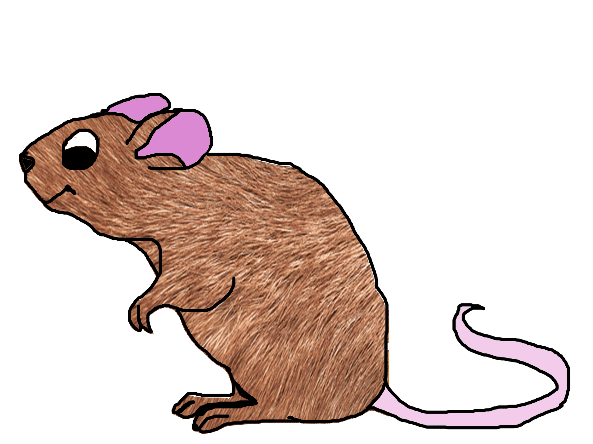
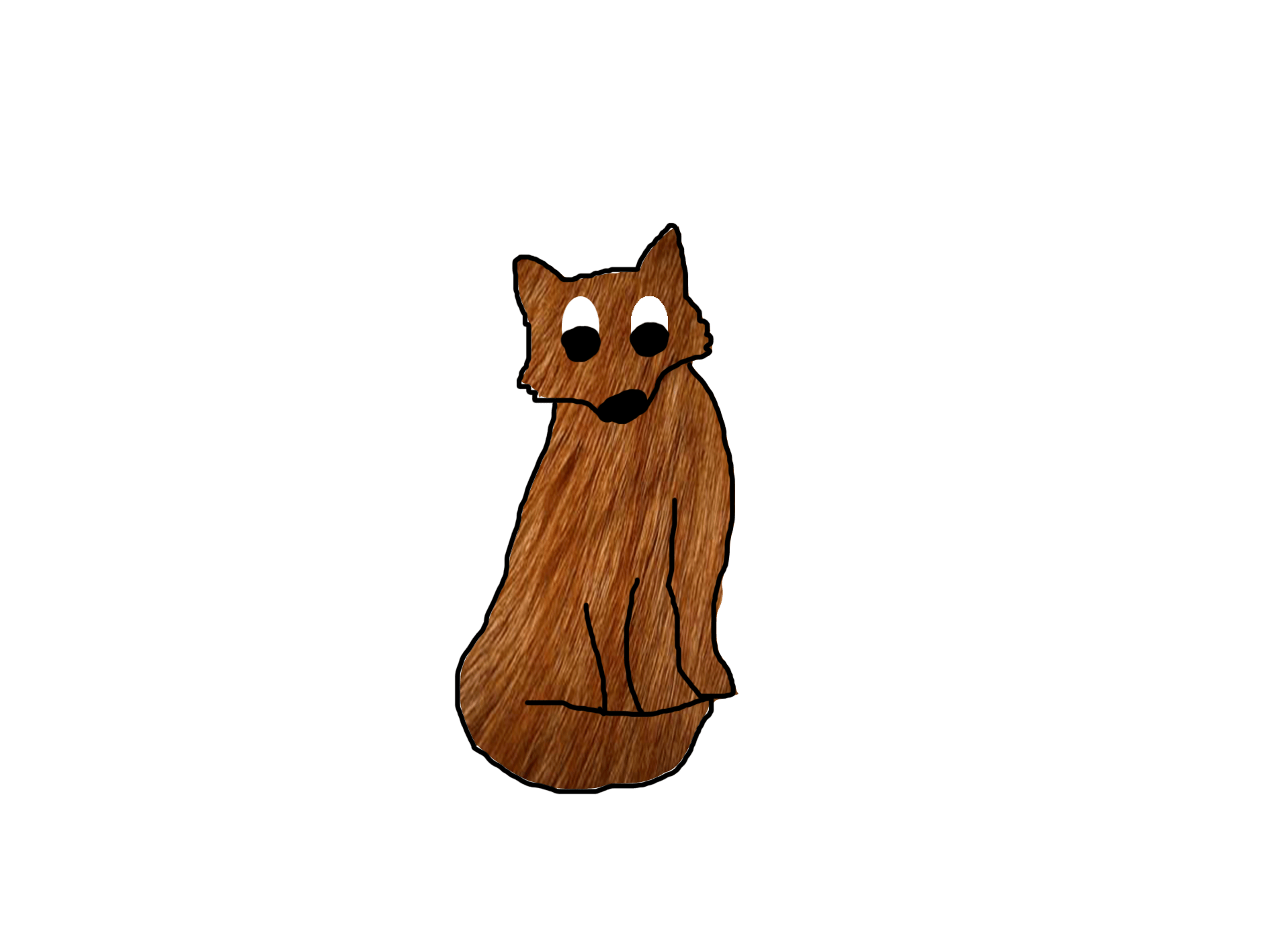
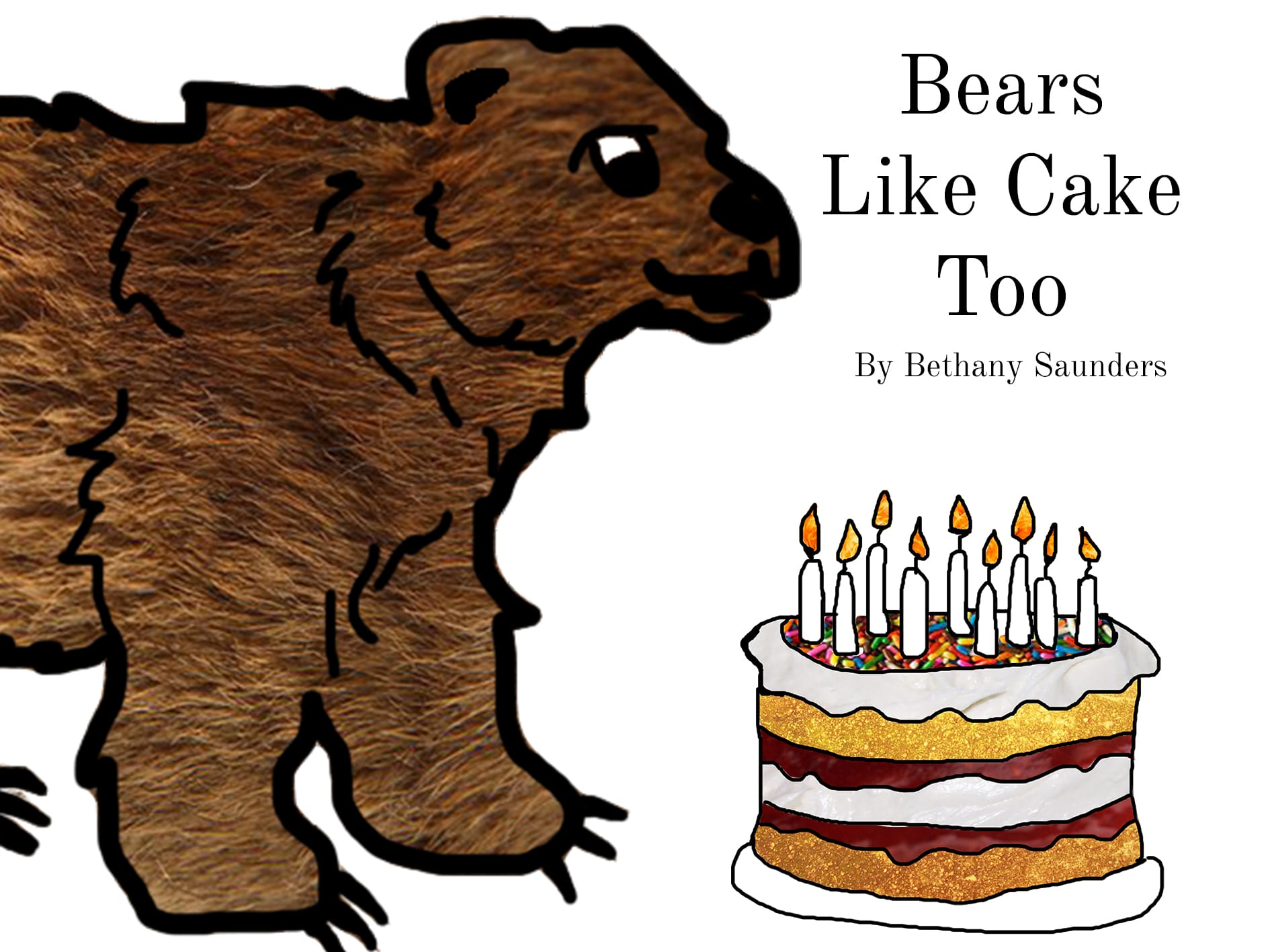
I created this first page with a similar style to the front cover thinking about the colour and the design of the features on the page. I wanted there to be bright images which then contrasted to that of the bear, to make him seem like he is not part of the Forest but wants to fit in with the other animals. 

I therefore, thought about the season I wanted to set it in, and thought that the summer sky would look appealing to the audience. This is my first draft of the first page.

Screen Shot 2016-04-22 at 12.04.47


I like the look of this and think that the textures work on the page with the bold type and the layout. It introduces the character and the texture of the bear looks realistic with the leaves and the sun. 

To create the sun, I wanted to keep to using real textures, however, I got this image of the sun online at 

http://www.solarsystemscope.com/nexus/textures/texture_pack/assets/preview_sun.jpg

I wanted to use the real texture because this is a source of learning for the children and the sense of seeing the sun texture. 

However, I think the colour on the background of the first page is dull and needs brightening up to match with the bright sun. 

Page 1-Recovered

The brighter colour shows the image in a happier way and this brightens up the characters and the text is easier to read. 

I am pleased with the look of the first page and the colours work with the layout and the characters.

Other Characters

When creating the party page, I didnt want there to be too many animals, as I want the reader to relate and connect with the three animals which are there. I therefore, wanted to create small animals to contrast the bear. 

Rachel the Rabbit

Screen Shot 2016-04-22 at 07.18.37


This is the drawing I did before putting the texture on. I think that the small features and the cute look of the rabbit is good as it will contrast the bear and highlight the moral of the story for the reader. 

rabbit_fur_closeup_9291371

Bunny-Drawing-4


Millie the Mouse

Screen Shot 2016-04-22 at 07.23.35


fur-31


Mouse


Felicity the Fox

Screen Shot 2016-04-22 at 07.26.03


18.free-fur-textures


fox


I am pleased with the way these characters look and I think they contrast the bear with being small and cute which will express the message of the book to the reader. 

Front Cover

I wanted to make the book colourful and also using the inspirations of Eric Carl and Judith Kerr, I wanted to create the plain background with the colourful images to make the design bold and interesting. For the audience being 5-7, using the textures is way to help them relate to different materials and characters and know what each character is. 

Front Cover

I like the way that the background is plain and the bear and the cake are the only features on the front cover, this lets the audience know exactly what its about and the character of the story. 

This front cover was inspired by the books of Eric Carl but I have added the texture work and created the characters through the use of digital media to create a modern children’s book which familiarises the reader with different textures.

The type I used on the book is ‘Old Standard’ as I think this font which works well with image and is easy to read, whether it be an adult to a child or a child learning to read. 

Screen Shot 2016-04-22 at 11.21.31

I want to use more colour on the pages of the book and the story will be bold and colourful with the textures and the other characters of the book. I decided to use a simplistic approach to the front cover as I wanted the two features of the book to be presented on the front and this should tell the reader about the genre and also the characters of the book. 

The Design of the Cake

Another image which is important in the book is that of the cake, which I also wanted to create using textures and to make the cake look realistic but also animated in the narrative. 

For this, I used the same technique as for the bear with using textures of the real cake ingredients for the image. 

Screen Shot 2016-04-22 at 06.33.41


I like the look of the cake being slightly to an angle as this makes the image look interesting and also similar to the style of the very hungry caterpillar which is the main inspiration for the book. 

The textures I used where for the cream, jam, the sponge and the fire.

strawberry_rhubarb_jam-5 Seamless background: colorful candy sprinkles blaze fire flame for banner background cream cheese frosting healthy-eating--cake--texture--bread_3200354

Which I then edited on Photoshop to make the cake.


Cake


I really like the design of this cake and I think the textures work with the story and the target audience of 5-7 years olds. It is fun and interesting to look at and read. 

First Design of the Bear

I wanted to create the bear and the characters digitally using textures to create the interesting look to the book, while keeping the simple colour pallet and the texture of the images. 

I first did the outline of the bear on photoshop with the paint tool with the black outline to get an idea of what I wanted the bear to look like. 

Screen Shot 2016-04-22 at 06.26.28


Then when I wanted to add a texture I decided to use photography and used a picture of close up dogs furr to create the effect of the bear furr texture. 

c5a0a53be946067f861035a01ea5fbd2


I then edited this in photoshop in order to create the texture of the bear’s furr. 

Bear


I like the look of the bear and think that this works with the theme of the book. Also using the inspiration of the authors of the very hungry caterpillar, Eric Carl and The tiger that came to tea, I want to see how this will look with the text and the cake for the front cover of the book.