Identity and Branding

The new brief is all about BRANDING AND IDENTITY and therefore, the first place to start would be thinking about business and brand design, and corporate identity:

The definition of corporate identity is:

“Combination of color schemes, designs, words, etc., that a firm employs to make a visual statement about itself and to communicate its business philosophy.”

The first thing to do was to look at a few examples of how businesses use design in order to express a message and or idea about the company to the customer.

The visual design of the brand is how the company would attract the customer and also the identity of their brand and therefore, this brief includes the semiotics of the design and how this would link to the identity of a brand.

I looked into how this is used in corporations and how branding is the key to the identity of a brand. Some branding is very functional and suits the point of the branding, however, the corporate branding which stands out is the creative ideas which also suit the identity of the brand. 

This website has a number of brand identity examples and how these designed and created a brand:

http://www.logodesignlove.com/brand-identity-style-guides

I looked at this for inspiration when thinking about how to start thinking about how to design a logo. The Penguin logo guidelines explain how the logo was designed. 
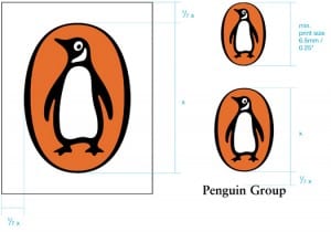
logo-print

Evaulation

For the first brief I created a modern day Art Deco type face which could be used in the context of a modern cafe that is inspired by the art deco movement and french inspired design. I first started off with trying to think how I could use visual effects in order to make the design modern, however I did not like the effect this gave it and therefore looked at ways I could add the modern edge to it by editing the structured rules which are with Art Deco. This worked as it gave the type a classic but more edgy look which could be used in the context of a modern day cafe. However, I could have worked with the lowercase letters more as I found this difficult to do through vectors and image trace. I would have liked to also look at ways to edit the letters through visual effects on photoshop, however as I was editing the type, I thought that the Art Deco style worked well and I didnt want to complicate the type as I also wanted it to be stylish and inspired by the Art Deco Design. 

I found that the second brief was more complicated for me to do as I had lots of ideas for the website, but I was unsure how to actually do this. I also thought that my time keeping for this brief was not very organised as I spent too long on perfecting the type and did not allow myself enough time to get the brief how I wanted it. I started off with the idea of the office which was an approach which I was excited about and I started to get ideas of what the game could be. However, working with vectors did not work as well as I had wanted and therefore I simplified the idea in order to get the animated look of the website. I could have used more time on the app as I think that I could have made the app different to the website as looking at them both, they are too similar and I think I should have spent more time working on the individual app, rather than the poster. I am happy with the poster and the graphics, it was a simple idea which works with the website and app. However, the background and the graphics are the same. I would have liked to work more on the Einstein graphic and give it more of an animated look as it looks like it is chalk drawn, however, this could have been better on the website. Overall, I was happy with the graphics and the interactive design of the website, app and poster, however, I could have managed time better and not spent as long on the typography in order to edit the website and app in a more complicated way, although I am happy with the look of them and the graphics. 

The Final Website Design

Final Website Design

I am happy with the website design and the idea of a game and interactive website works well with the audience of the GCSE student. I wanted to create a simple colour theme and didn’t want to complicate the website as this would not have worked with the audience and the subject of the theory of relativity. 

Final Website DesignI have edited the graphics so that they look sleaker on the page and the layout has been adjusted to make the website easier to use. I think this works well and the design is simple but effective for GCSE students to use. 

iMac 5k Retina Office Mockup with Items

second page of website

The Final Poster Design

Einstein’s Achievements Poster

Poster and Infograph


For the poster and Inforgraphic I have done a timeline of Einstein’s achievements. The first three boxes explain the scientific facts which are based around Light, Earth and Gravity. I wanted to show each fact with a representation of a graphic. The same Einstein graphic is there and this is clear that it is shown on the website and the app. I wanted to create the background as though it is from the game on the website and this could also be a feature of the website and app with the game. 

I did each graphic from scratch aside from the Einstein one which was from the Noun Project as I thought that this worked well and looked interesting on the page. 

I am happy with the look of the poster and infographic and the blackboard theme, the information is presented in a way the audience will understand and there is bright graphics which work with the facts. 

Final App Design

The Final App Design


I have finalised the app design and I have created mock ups to see what the product would look like. I have edited a few things with the graphic and layout of the app and am happy with the look of the app and the style. 

App Front Cover 1st Draft


App


Einstein App 1


Einstein app 2


I am happy with the way the app looks as it is a simple style which is bold and works with the website design with the character graphic and the colour scheme.