First attempt At Digital Art Deco Type

I had a look at a few original Art Deco fonts and I wanted to have a go at creating my own version of a traditional Art Deco type face. 

Web


I used this type as an example for creating an original typeface on Illustrator and a starting point for creating a modern Art Deco type. 

Screen Shot 2015-10-29 at 22.11.27


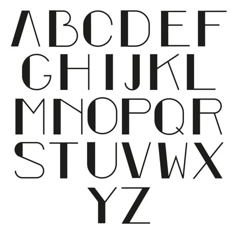
This was the first attempt at a traditional Art Deco type, using Illustrator to create a simple letter which I could then experiment with a modern interpretation. I wanted to get an idea of how I could first create a simple letter and then I could experiment with different types of design. 

Screen Shot 2015-10-29 at 22.24.21


I then had a look at changing the curvature of the letters and how they could be used to change the very structured style of Art Deco and experiment with the different techniques. I like the way in which the Art Deco design is familiar, but there is a more relaxed style. 


Screen Shot 2015-10-29 at 22.19.19


This was an experiment with how to change the Art Deco style and the stretching of the letters and how this could be used in a modern typeface. I like the way that the letters are in a way that represents a different style of design but the Art deco is still familiar. 

Screen Shot 2015-10-29 at 22.18.07

I then wanted to see what the style of type would be if I created a typeface that does not involve the structure of Art Deco at all and shows a very experimental and modern style of design. 

I like this approach to creating the modern Art deco style by starting with the Art Deco design and then editing it to see how this could be a contemporary design. 


A.M. Cassandre’s Bifur

501305

A.M. Cassandre’s Bifur


A.M. Cassandre was a painter, graphic designer, poster artist and stage designer from 1923. He lived in Paris in the 1920’s and was famous for the posters he created which where a bold, stringently geometric Art déco style.

Bifur is an example of his Art Deco type which uses this bold, structure. I like the way in which he uses the structure of the Art Deco and also experiments with the organised style. 


6a00e554e97d5c8834011570700fed970b-800wi

The style of this typography shows how I want to use the organised Art Deco themes and also use a modern interpretation of the style. 

A Theme for Thought

Themes

I have decide on a theme for the type which uses both the traditional type face inspirations and also urban typography as a design. The theme shall be Modern Art Deco design which focuses on using these as a creative take on traditional Art Deco design. 

Art Deco style, particularly when used throughout the 1920’s in New York is typically designed using Bold, Geometric shapes in repetitive patterns. I want to use creative modern typography which has been created in design in the 21st century create a visually interesting Typeface. 

What and Where?

So the idea is to create a creative art type face, which includes elements of the traditional Art Deco style of the lavish and luxurious, but also experimenting with creative modern art inspirations to explore a new, fun typeface. 

When thinking about where I could use this font in a product or service, I think that the theme works very well with the Parisian cafe style, however, in a contemporary setting or similar boutiques which would suit this. I have looked at traditional Parisian cafe’s which are shown to have used the Art Deco type and how the has influenced the style of the business. 

patisserie_valerie_websitecafeLeTournonExterior

The first picture is Patisserie Valerie and this is a mainstream brand which uses and Art Nouveau style and is a classic typeface common in within the traditional French Cafes. 

I want to create a typeface which could be used in a contemporary setting of a modern cafe by experimenting with a creative interpretation of the Art Deco typeface. 

Modern cafes such as the ones in London have a handwritten or a rustic style to them which contrasts the traditional Art Deco style. I want to explore how this will impact a traditional style and how this would affect the brand of a modern cafe. 

bold-street-coffee-liverpool-6photographers-gallery-cafe-2_600x399-600x399London-paticdscn75822-1396347177-foxcroft-ginger-best-london-cafes__square

These modern cafes in London are an example of how the contemporary cafe brands are using traditional styles of design with the handwritten and the stencil type. These are being used in a contemporary setting which I want to use with a modern interpretation of the Art Deco style. 

Urban Typography

When looking into Art Deco Design, the style is very structured and organised and I wanted to get an understanding of something that contrasts this in modern day design. I have always been interested in how tradition could be combined with contemporary design to create an interesting product.

Urban Typography

Urban Typography is everywhere, when walking up the High Street, there are hundreds of examples and thinking about the first blog post, I found a number of interesting Type examples around Lincoln which are different to that of the very structured and luxurious style of Art Deco. 

I found an interesting blog called ‘The Journal of Urban Typography’ which features a wide variety of urban Typefaces the world. The type in a number of the pictures features handwritten or stencil designs. 

Screen Shot 2015-10-29 at 21.46.26


I like the way that these are hand drawn and this design that is not structured, organised and is creative in it’s design. This contrasts that of the art deco style, yet both have been used in urban cities with the rise of the Art Deco in New York in the 1920’s. I think that this is very interesting in having two very contrasting designs that could work together in a city. 

I also looked at the way in which modern typographers have been using digital media to create visually interesting work. 

Rus Kasanov

rus_khasanov


Rus Kasanov is a Russian-born designer who has worked for clients such as Adobe, Bloomberg Markets, Computer Arts, HTC, GQ, Popular Mechanics, Popular Science and Wired. 

He has created typefaces using laptop screens, tasers, and soy sauce. One of his projects which I found particularly interesting is his work with the digital music video  “Crystallize” using Salycylic acid and sugar under a microscope. Even though the project is not strictly about Typography, there are still elements to his work which I find very interesting. 


What I like about this is the cross media use of Typography. The very visually interesting shapes of the type have been used in order to create a digital piece of work which could also be considered very creative in design. I would like to see how two medias could be used to create interesting Typography. 

I really like the idea of using both traditional and modern typographical styles and see how they could work together. I want to look at how Art Deco could be used with modern technologies to create a modern Art Deco design.