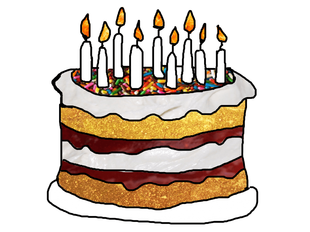
Another image which is important in the book is that of the cake, which I also wanted to create using textures and to make the cake look realistic but also animated in the narrative.
For this, I used the same technique as for the bear with using textures of the real cake ingredients for the image.
I like the look of the cake being slightly to an angle as this makes the image look interesting and also similar to the style of the very hungry caterpillar which is the main inspiration for the book.
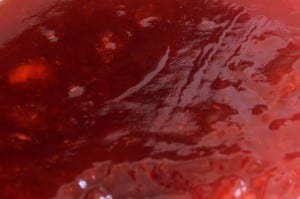
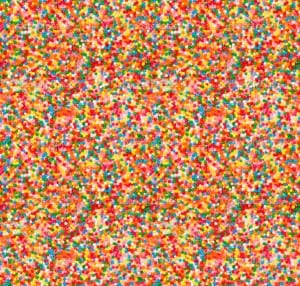
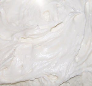
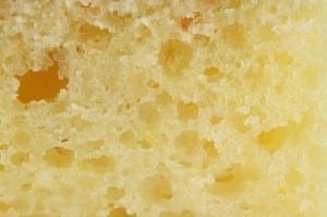
The textures I used where for the cream, jam, the sponge and the fire.
Which I then edited on Photoshop to make the cake.
I really like the design of this cake and I think the textures work with the story and the target audience of 5-7 years olds. It is fun and interesting to look at and read.


Leave a comment