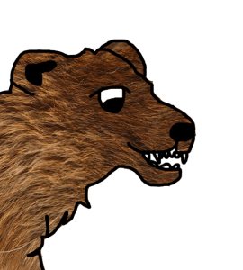
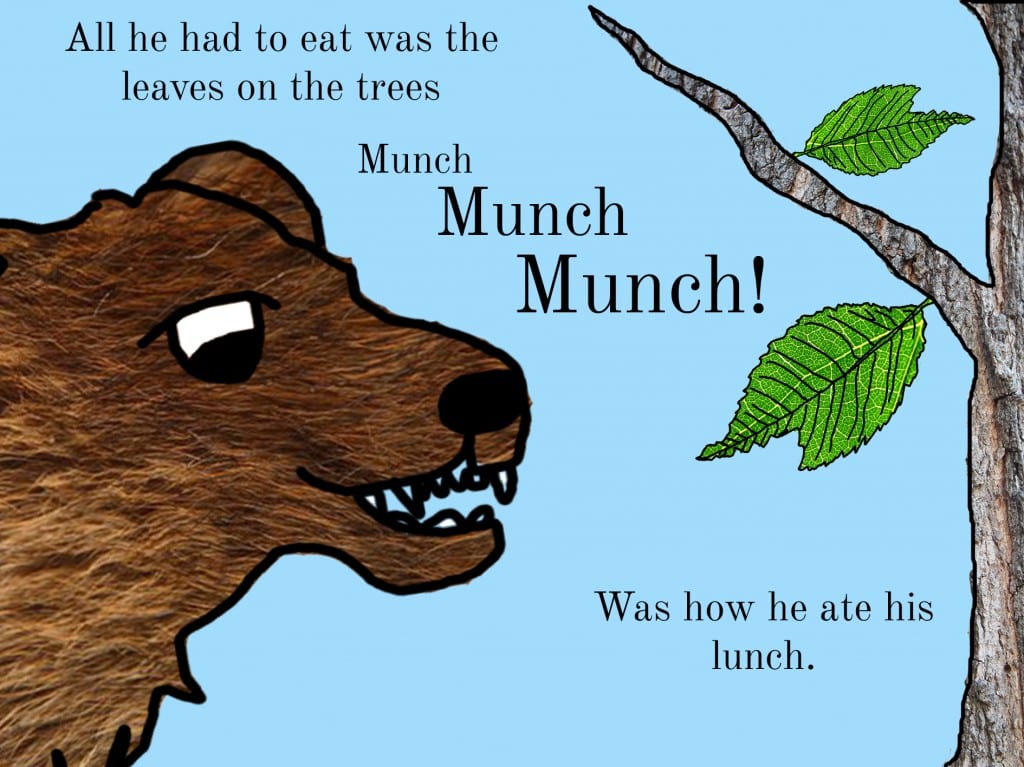
For the Second page, I needed the bear to be eating and therefore, I wanted to create an image of him looking unaware that he is missing out on the food which is at the party. Therefore, I made him look neutral, however with a big expression on his face to be humorous for the children.
I drew the outline of the bear close up and added teeth to suggest he is eating, then adding the texture to the outline.
The wording on this page is stepped to create movement, something which is used in a number of children’s books as it is more interesting to read allowed to Children. I kept with the same background to suggest he is in the same location and the leaves are also created with real images of the leaves zoomed in.
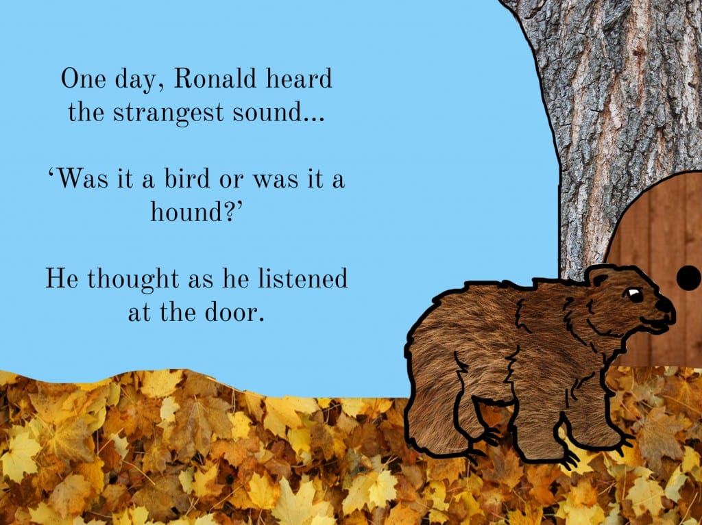
This page was to suggest to the reader that Ronald is looking into the house for the party. I like the design of this as it explains that Ronald is too big to fit through the door as well as physically showing his difference and exclusion with the tree house and him being outside.
I decided to not include the sun and the clouds in the background of this page as I wanted to suggest that he has moved along the Forest and the weather is clearing as he hears the noise of the other animals.
I am pleased with how these pages look, and I like the design of the different features of the book.


