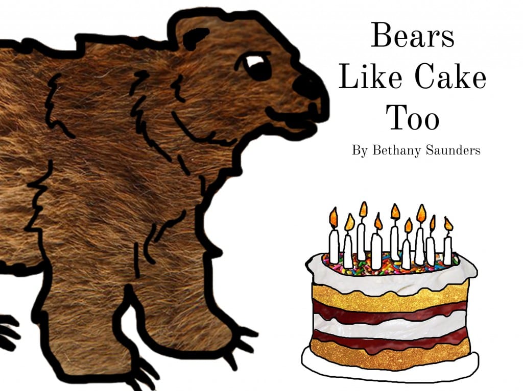
I wanted to make the book colourful and also using the inspirations of Eric Carl and Judith Kerr, I wanted to create the plain background with the colourful images to make the design bold and interesting. For the audience being 5-7, using the textures is way to help them relate to different materials and characters and know what each character is.
I like the way that the background is plain and the bear and the cake are the only features on the front cover, this lets the audience know exactly what its about and the character of the story.
This front cover was inspired by the books of Eric Carl but I have added the texture work and created the characters through the use of digital media to create a modern children’s book which familiarises the reader with different textures.
The type I used on the book is ‘Old Standard’ as I think this font which works well with image and is easy to read, whether it be an adult to a child or a child learning to read.
I want to use more colour on the pages of the book and the story will be bold and colourful with the textures and the other characters of the book. I decided to use a simplistic approach to the front cover as I wanted the two features of the book to be presented on the front and this should tell the reader about the genre and also the characters of the book.

