French Branding and Identity

‘Les Barbe Magnifique’ translates into The Magnificent Beard which is grande and regal and explores the themes of French culture. 

71s69HU+cJL._SL1440_

After looking at the barbers pole image and the french connotations of the name, the colours specifically stood out and linked together. So I started to think about the French design and the french culture of both the history and French barber shops. 

I thought about the image of the barber pole and how I could use this with the French design looking at the colours and the design. 

The barbers pole and the French flag use the same colours and I wanted to look at how these two could be combined to create branding for a company.

french-flag-facebook

“Red, white and blue have come to represent liberty, equality and fraternity – the ideals of the French Revolution. Blue and red are also the time-honored colors of Paris, while white is the color of the Royal House of Bourbon.”

Colour is something I would like to experiment with and explore French Culture within the design and branding and look at how vintage barbers brand their products. 

Les Barbe Magnifique

When I thought about which company to create the branding for, I thought Le Barbe Magnifique would allow for creative branding and to look at historical and modern design. So when I first began to look at how I could create the design for this, I looked at the history of Barbers and how they attract their audience. 

url-e1361370383693barber_shop_old_1burckhardt_03.Lalexander_grooming_barbershop_stalbans_smallc478d4dd-bb85-4b36-a142-39f2ac61a4a5_338vintage-barber-shop-pictures-i5

The classic design of the barber shops all involve simple graphics with the common theme of the barbers pole. I then looked into what this represents and why most barbers would involve this in their branding. 

“The barber-surgeon’s pole actually originated from the rod that the poor patient grasped in order to make their veins bulge – this made it easier to cut or slice open. The brass ball at the top represented the basin that was used to collect the blood. The red and white stripes symbolised the blood soaked bandages, which would be washed then hung to dry on the rod outside the shop. The bandages would often twist in the wind, and this forms the spiral pattern we see on the barber poles of today.”

The Barbers pole represents different elements of the traditional barber techniques, both traditional barbers and modern barbers use this in their design. 

Barbers_Pole

I like the idea of incorporating the traditional barber style into the modern design and explore how the traditional and modern design techniques work. 

Identity and Branding

The new brief is all about BRANDING AND IDENTITY and therefore, the first place to start would be thinking about business and brand design, and corporate identity:

The definition of corporate identity is:

“Combination of color schemes, designs, words, etc., that a firm employs to make a visual statement about itself and to communicate its business philosophy.”

The first thing to do was to look at a few examples of how businesses use design in order to express a message and or idea about the company to the customer.

The visual design of the brand is how the company would attract the customer and also the identity of their brand and therefore, this brief includes the semiotics of the design and how this would link to the identity of a brand.

I looked into how this is used in corporations and how branding is the key to the identity of a brand. Some branding is very functional and suits the point of the branding, however, the corporate branding which stands out is the creative ideas which also suit the identity of the brand. 

This website has a number of brand identity examples and how these designed and created a brand:

http://www.logodesignlove.com/brand-identity-style-guides

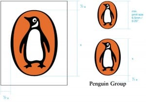
I looked at this for inspiration when thinking about how to start thinking about how to design a logo. The Penguin logo guidelines explain how the logo was designed. 

logo-print