A.M. Cassandre’s Bifur

501305

A.M. Cassandre’s Bifur


A.M. Cassandre was a painter, graphic designer, poster artist and stage designer from 1923. He lived in Paris in the 1920’s and was famous for the posters he created which where a bold, stringently geometric Art déco style.

Bifur is an example of his Art Deco type which uses this bold, structure. I like the way in which he uses the structure of the Art Deco and also experiments with the organised style. 


6a00e554e97d5c8834011570700fed970b-800wi

The style of this typography shows how I want to use the organised Art Deco themes and also use a modern interpretation of the style. 

A Theme for Thought

Themes

I have decide on a theme for the type which uses both the traditional type face inspirations and also urban typography as a design. The theme shall be Modern Art Deco design which focuses on using these as a creative take on traditional Art Deco design. 

Art Deco style, particularly when used throughout the 1920’s in New York is typically designed using Bold, Geometric shapes in repetitive patterns. I want to use creative modern typography which has been created in design in the 21st century create a visually interesting Typeface. 

What and Where?

So the idea is to create a creative art type face, which includes elements of the traditional Art Deco style of the lavish and luxurious, but also experimenting with creative modern art inspirations to explore a new, fun typeface. 

When thinking about where I could use this font in a product or service, I think that the theme works very well with the Parisian cafe style, however, in a contemporary setting or similar boutiques which would suit this. I have looked at traditional Parisian cafe’s which are shown to have used the Art Deco type and how the has influenced the style of the business. 

patisserie_valerie_websitecafeLeTournonExterior

The first picture is Patisserie Valerie and this is a mainstream brand which uses and Art Nouveau style and is a classic typeface common in within the traditional French Cafes. 

I want to create a typeface which could be used in a contemporary setting of a modern cafe by experimenting with a creative interpretation of the Art Deco typeface. 

Modern cafes such as the ones in London have a handwritten or a rustic style to them which contrasts the traditional Art Deco style. I want to explore how this will impact a traditional style and how this would affect the brand of a modern cafe. 

bold-street-coffee-liverpool-6photographers-gallery-cafe-2_600x399-600x399London-paticdscn75822-1396347177-foxcroft-ginger-best-london-cafes__square

These modern cafes in London are an example of how the contemporary cafe brands are using traditional styles of design with the handwritten and the stencil type. These are being used in a contemporary setting which I want to use with a modern interpretation of the Art Deco style. 

Urban Typography

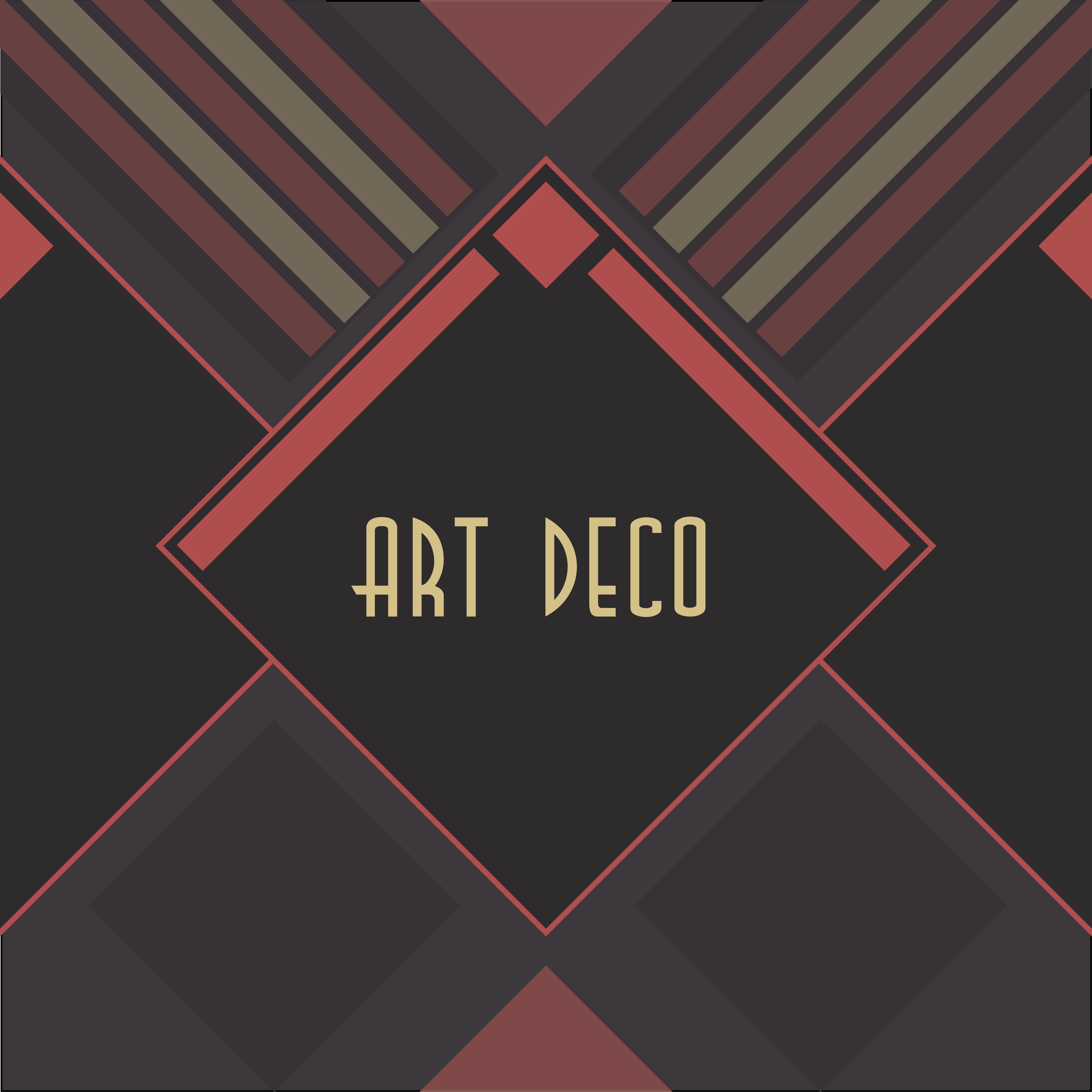
When looking into Art Deco Design, the style is very structured and organised and I wanted to get an understanding of something that contrasts this in modern day design. I have always been interested in how tradition could be combined with contemporary design to create an interesting product.

Urban Typography

Urban Typography is everywhere, when walking up the High Street, there are hundreds of examples and thinking about the first blog post, I found a number of interesting Type examples around Lincoln which are different to that of the very structured and luxurious style of Art Deco. 

I found an interesting blog called ‘The Journal of Urban Typography’ which features a wide variety of urban Typefaces the world. The type in a number of the pictures features handwritten or stencil designs. 

Screen Shot 2015-10-29 at 21.46.26


I like the way that these are hand drawn and this design that is not structured, organised and is creative in it’s design. This contrasts that of the art deco style, yet both have been used in urban cities with the rise of the Art Deco in New York in the 1920’s. I think that this is very interesting in having two very contrasting designs that could work together in a city. 

I also looked at the way in which modern typographers have been using digital media to create visually interesting work. 

Rus Kasanov

rus_khasanov


Rus Kasanov is a Russian-born designer who has worked for clients such as Adobe, Bloomberg Markets, Computer Arts, HTC, GQ, Popular Mechanics, Popular Science and Wired. 

He has created typefaces using laptop screens, tasers, and soy sauce. One of his projects which I found particularly interesting is his work with the digital music video  “Crystallize” using Salycylic acid and sugar under a microscope. Even though the project is not strictly about Typography, there are still elements to his work which I find very interesting. 


What I like about this is the cross media use of Typography. The very visually interesting shapes of the type have been used in order to create a digital piece of work which could also be considered very creative in design. I would like to see how two medias could be used to create interesting Typography. 

I really like the idea of using both traditional and modern typographical styles and see how they could work together. I want to look at how Art Deco could be used with modern technologies to create a modern Art Deco design. 

Art Deco Design

The Art Deco Style

art-deco-cover-26

I looked further into the art deco design of the 1920’s and wanted to get a better understanding of the origins of this movement and how I could incorporate this into my design. It has many features which are similar to that of the nineteenth century Art Nouveau art movement which:

Relied on floral motifs to pattern and ornament its building and other artefacts, whereas, Art Deco was thoroughly modern in turning away from the winding, sinuous qualities of Art Nouveau, looking instead to those of abstract design and colour for colour’s sake.”  (Art Deco, Grange Books.) 

This style that was very structured and organised was something that interested me and I wanted to see how I could experiment with this in my own way and see how this could be used to create an interesting and different style. I began with a simple drawing of a few letters as a simple Art Deco design. 

IMG_5029

I decided to experiment with the use of lines and the structured detail of the letters which I think worked well with the original design and gave the letters a sense of modern typography design. However, this design is very simple and could have a lot more done to it in order to create a more visually interesting type face. 

Experimenting with Art Nouveau

In order to get a better understanding of the inspirations of Art Deco, I decided to create my own Art Nouveau inspired letter and to see how this could influence my typographical style. I liked the Art Nouveau poster design and particularly liked the design of this typeface and the floral aspect to it. 

 Poster

IMG_5033

IMG_5035 The first image is my sketch of an example of an Art Nouveau style typeface and was particularly inspired by particularly the poster design. I really like the bold pattern of the letters and how this reflects the style of Art Nouveau in Paris. 

The second image shows the improvements I made to the original design in colour and detail. When looking at the Art Nouveau style, the colour and the pattern was something which was very bold and I wanted to reflect that in my design. I used Gold and Silver paint markers which have relevance to the Art Deco style, particularly in New York 1920’s/30’s and I liked how this made the letter stand out and reflect the luxurious style of the Art Deco Design. 


“There was going to be no more poverty, no more ignorance, no more disease. Art Deco reflected that confidence, vigour and optimism by using symbols, of progress, speed and power.” – Robert McGregor.